JESSE REICHEK
Paintings from 1947 to 2005
Text by James S. Ackerman
Reichek Retrospective – Partners in Creation
August 27, 2005
- August 16, 2006
Marin French Cheese Company
7500 Red Hill Road Petaluma CA
Jesse Reichek’s career as a painter is like none other. For twenty-five years from the time when he began to paint full-time in Paris in 1947, his work attracted increasing attention from major critics and dealers and was shown and reviewed in Paris, Tokyo, New York, Los Angeles and San Francisco. In 1971, having become disheartened by the operations and demands of the art world, he decided to forego exhibiting entirely and to show his work only to the few friends he invited to his studio. In 1972, he and his wife built a simple house at the northern edge of Marin County near Petaluma, California, cantilevered over a small pond visited by deer, cattle, and donkeys, and nestled in a beautiful site overlooking the unspoiled landscape of surrounding ranches and olive groves protected from development. In the huge barn-like studio nearby, he has untiringly produced over 2500 paintings, many while he was commuting regularly to the University of California in Berkeley to teach design in the College of Architecture.
Jesse Reichek was born in New York in 1916 to Orthodox Jewish parents. Though he attended Yeshiva as well as public schools, he was not religious, but—like many others in this community—he acquired a lifelong commitment to social justice and became a vigorous critic of entrenched power. Before entering the Army in 1941 (where he served as a camouflage instructor), he attended the Chicago Design Institute, where instruction had been inspired by the innovative design programs originating in the Weimar/Dessau Bauhaus in the late twenties and early thirties, prior to its suppression by Hitler’s government. On returning to civilian life, he used a grant provided to veterans by the G.I. Bill to travel to Paris and to begin his calling as a practicing painter. To fulfill the educational stipulation of the grant, he arranged a nominal affiliation with the Académie Julien, requiring attendance only one day a week. He remained in Paris for four years.
In 1950, Jesse met and soon married Laure Guyot, who was just completing her secondary education. Laure is the daughter of a French painter who lived on a houseboat on the Seine and of a Native American mother, who had died of an infection contracted in the rescue of a drowning person from the river. The marriage became the most mutually supportive one I have ever witnessed; a large printed banner in Jesse’s studio reads: “This work has been made possible by Laure.” Despite her role as Jesse’s muse and supporter, she never permitted that commitment to impinge on her dedication to aiding people in need, from initiating and raising funds for a truck farm to employ the homeless to visiting and advocating for sick and needy fellow-citizens, and to working tirelessly against two wars.
When I asked him recently which painters he had been attracted to at the time of his arrival in Paris, he spoke of his great admiration for Klee, Kandinsky and Mondrian, artists whose early works had been representational but who—with the exception of Klee—soon turned to abstraction. Many years later (1966), he published with the Tamarind Workshop in Los Angeles three small booklets of lithographic prints without text, entitled Hommage to Klee (to Kandinsky, to Mondrian); the prints were not calculated to resemble the works of the artists, but to affirm his debt to them. His understanding of the practice of abstraction was not one of “abstracting-from” forms of the visible world, as many of the post-cubist and surrealist European artists whose works were being exhibited in Paris at the time were doing (for example, Fernand Léger, Joan Miró). Rather, it was the making of an alternative non-representational vocabulary of forms that interact with each other. To me, the word “concrete” better reflects this position. Nevertheless, Jesse’s most lasting friendship with a Parisian artist at this time was with Jean Hélion, who did, in fact, derive his abstract forms from the visible environment.
The distinction is evident in Jesse’s first, very brief, published essay (Arts and Architecture, 1951):
It is not what I see that is important to me. Vision is but one means of absorbing or projecting the construction of forces which is experience. The problem is in the way these forces are constructed: giving rise to the endless variety of experiences and acts of which we are capable.
Such experiences and acts as: space, color, light, motion, time, forms, moods, emotions, personal history, social comment, imaginary worlds, etc. etc., are indeed undeniable facts. But facts, regardless of the amount of detail they include, are limited truths. The process, ever-changing and limitless, by which these facts are constructed is the constant truth. These elements are placed according to the dictates of the conceived structural form; the conceived functions, potential functions, and possible functions of the structured form as a totality.”
This particular approach to painting in terms of structure and process has remained constant to the present. What Jesse means is that each painting is an attempt to “describe the inherent structure of experience, which is a “process structure.”[1]. For Jesse, the act of structuring or ordering the elements on a canvas is, so to speak, the fashioning of a template capable of incorporating human endeavors from individual life experience at one pole through to the organization of society at the other. This structure, however, does not represent a particular individual or society because it is open to the accommodation of different experiences and contexts; this is where process comes in. What Jesse calls process-structure is dynamic, a structure that not only is common to all events but is a metaphor for the relationship between events; the import of the work of art changes with the experience of each viewer and with the physical and cultural environment. To borrow a metaphor from Jesse’s essay on urban planning, which is rooted in the same theoretical foundation, a plan devised for a city is a structure that may, like the form of a painting, remain to some degree constant but which must accommodate the process of shifts in and relations between the economy, the population, the technology, the political climate, and so on.
The few surviving works from the Paris years are experimental in the sense that they represent a search for an authentic vehicle for the artist’s convictions and are quite different one from another in both structure and color, as revealed by photographs of the installation of his first exhibition, in May, 1951, at the gallery of Cahiers d’Art, a journal edited by the critic Christian Zervos. Zervos was a major figure in the Parisian art world of this time; his enthusiastic support of Jesse’s work not only attested to its originality and quality but gave the artist’s career a momentum that must have influenced his reception on his return to the United States. The paintings in the Galerie des Cahiers d’Art show were all relatively small, as is usual in the work of young artists working in limited space on meager budgets. The most distinctive of them are those which, like 25 October 1950, are suggestive of microscopic, amoeba-like, biological forms that are connected by thin, sometimes nervously meandering lines.[2]
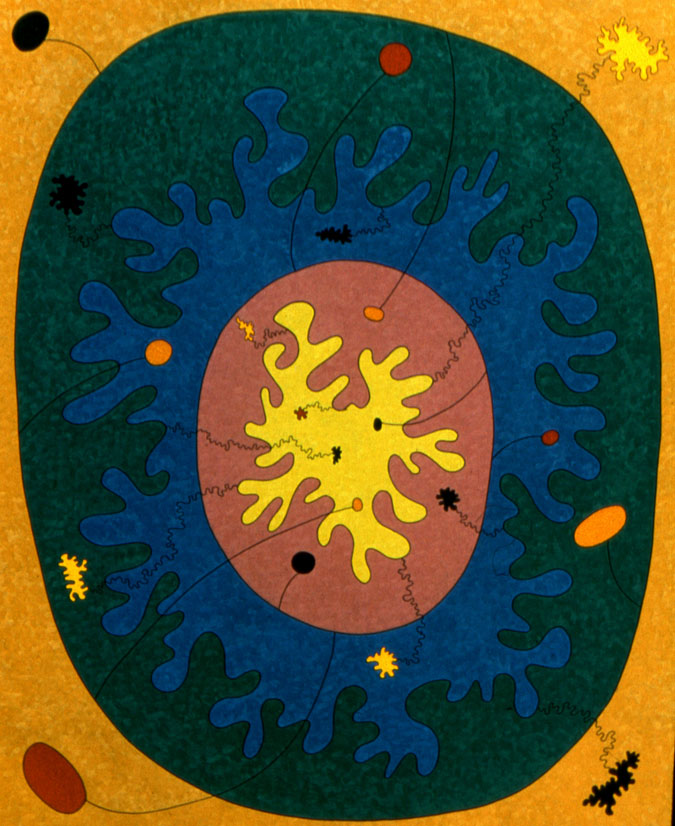
Fig. 1 25 October 1950 (63 3/4” × 51 1/2”) oil on canvas
In 1951, Jesse was invited by Serge Chermayeff, his former teacher at the Chicago Design Institute, to become the head of the basic design curriculum at the Illinois Institute of Technology in Chicago.[3] In 1953, he was invited by Dean William Wurster to join the faculty of the School of Architecture at the University of California in Berkeley, where we first met—I had been appointed to teach architectural history in the previous year—and became close friends for over half a century.
A book entitled Dessins, published by Cahiers d’Art in 1960, was especially innovative at the time in being a volume consisting exclusively of forty-eight well-printed reproductions of drawings—mostly China black ink on a white ground—prefaced by brief texts by Saul Bellow and Zervos.
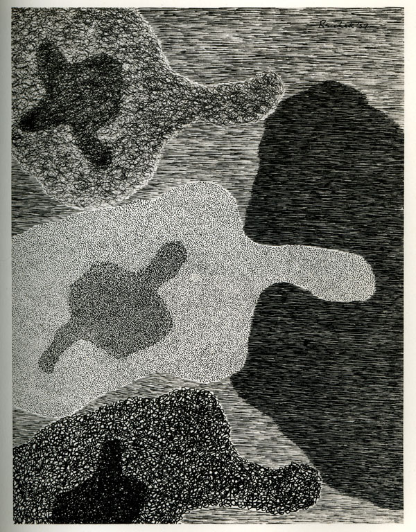
Fig. 2 Dessins 11, 1957 (6 3/4” × 5 1/4”) ink on paper
The sheets are unbound so that the owner might frame a selection. The drawings employ a great variety of surface shapes, each with its own overall texture. Figure and ground sometimes exchange places—the white of the paper or intensely inked dark areas may be read as either.[4] Almost all the figures are two-dimensional, typically agitated shapes defined by their surfaces and by undulating contours. As each figure has a specific texture—lines, squiggles, dots predominate, the contours are determined by the texture: while the individual figures appear at first sight to be separated by outlines, their edges are not lines but simply the termini of their textured fields.
There is an intense, obsessive attack on the paper, every stroke being so deliberately placed that no inconsistencies are allowed. Any misstep would have caused the abandonment of the sheet and a fresh start on a blank one. The drawn image in this collection is always a fragment of a greater whole. While its component figures are fixed in place and interact with one or more others within the frame, most of the shapes seem to continue outside the borders of the sheet, and only occasionally the edges of one or two near the middle of the drawing have been completed within the frame. Each drawing, thus, becomes a microcosm of an infinity. Dessins may be read as a metaphor of matter and void in the universe.
Beginning in 1958, Jesse began to exhibit in New York at the Betty Parsons Gallery and showed his work there regularly until 1968. Since 1950, Parsons had been the most acute and prophetic promoter of the major painters of the “New York School” of abstract artists, having regularly exhibited for a decade the work of Elsworth Kelly, Willem de Kooning, Lee Krasner, Barnett Newman, Jackson Pollock, Mark Rothko, Clyfford Still, and others of this extraordinary group of painters who became the first Americans to exert an influence on a worldwide scale.[5]
While the fifties had been dominated by their approach, which critics labeled “Abstract Expressionism,” the attention of the commentators and curators of the following decade turned to two styles that developed in quite different directions, from each other and from expressionism: Pop Art, which adopted themes and styles from the imagery of popular culture and commerce (Robert Indiana, Roy Lichtenstein, Claes Oldenburg, Ed Ruscha, Andy Warhol, Tom Wesselman); and so-called Minimal Art, which remained entirely abstract and severe and was defined most frequently in reference to the work of sculptors, often in the form of installations (Carl André, Donald Judd, Robert Morris, Tony Smith, Robert Smithson). Most painters working in a similar mode (e.g., Al Held, Sol Le Witt, Agnes Martin, Ad Rinehart, etc.) also employed geometric forms and what were termed hard-edge figures. In suggesting that this group bears close comparison to Jesse’s work, I do not imply that he was influenced by or felt affinity to them—he paid as little attention as possible to contemporary art—but just that he was similarly dedicated to meticulously painted and primarily planar figures, clearly defined edges, and a restricted color range. Such basic structures as the rectilinear grid permeated our consciousness without our knowing it, most obviously in architectural and urban design, the field in which he was teaching.
The exhibition at the Parsons Gallery in April of 1963 was unique in consisting almost entirely of paintings on shaped surfaces of Masonite (fig. 3, Betty Parsons Gallery, New York, 1963). They are, in a sense, planar sculptures. Not only are the edges of the supports sawed into curvilinear and extruding shapes, but in certain cases the interiors are cut into as well.
The installation photograph shows both types, along with another hybrid of painting and sculpture, a squared pier with paintings on each face.[6] The approach and the formal vocabulary of Dessins were continued in etcetera,[7] a second book of drawings without words published as a New Directions Paperback in 1965. The small canvases in the 1967 exhibition at the Galerie des Cahiers d’Art in Paris are simpler, untextured, black-on-white refinements of these drawings (fig. 4, Galerie des Cahiers d’Art, Paris, 1967).
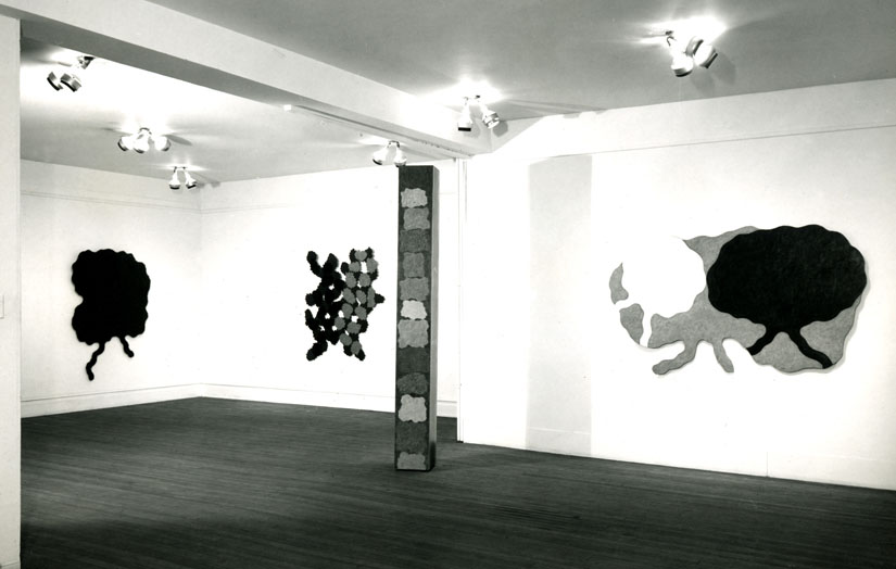
Fig. 3 Betty Parsons Gallery, New York, 1963
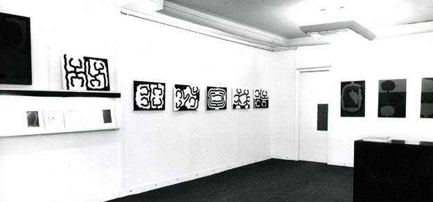
Fig. 4 Galerie des Cahiers d’Art, Paris, 1967
In 1969, Jesse was contacted by the art critic Jane Livingston, who had been engaged to curate a project supported by the American Telephone and Telegraph Corporation and other major corporations to form collaborations between each corporation and an artist. Jesse agreed to collaborate with IBM and its Los Angeles Scientific Center to work with engineers who were developing methods for two-dimensional graphic design by computer. The goal was to create programs capable of producing series of prints resulting from the collaboration between the machine and the artist. Because Jesse’s graphic work at this time, especially in preparation for the book e.g.,[8] had dealt with permutations of a few simple rectilinear elements, based on a grid of squares and rectangles, he was well prepared for the experiment. The project led to a major exhibition and catalog at the Los Angeles County Museum of Art. Jack Citron, IBM’s technical director of the project, wrote in the catalog, “Reichek’s work is in some ways ideal for this [experiment] because his principal thematic component—what he refers to as “process”—is methodology. And methodology is the essence of science and technology.”
In 1970, the Smith Andersen Gallery in San Francisco published e.g., the artist’s third graphic collection without text. The drawings are constructed of inked black lines of the same width that delineate rectilinear areas of different dimensions and proportions (fig. 5, e.g., p. 14, 1970, 7” × 6 1/2”) ink on paper.
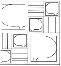
Fig. 5 e.g., p. 14, 1970, (7” × 6 1/2”) ink on paper
Each has one or more squares that enclose a distinctive curvilinear shape and other empty rectangles. There’s an ambiguity between figure and ground and between the boundaries of one rectangle and another. Some of the test sheets from the I.B.M. project are closely related to the plates in this book.
Jesse’s decision in 1968 to retire from gallery affiliation and ultimately from exhibiting altogether (although he did show his work once at a San Francisco gallery in 1969 and once at the Los Angeles County Museum in 1971) was motivated partly by his distaste for the commercialism of the art world, and partly by his desire to work in an atmosphere undisturbed by competitiveness and the expectation on the part of dealers that he be available in person to promote his work. From 1971 until the opening of the present retrospective, his achievement has been inaccessible except to a small group of friends.
THE E.G. PAINTINGS, 1966–1976
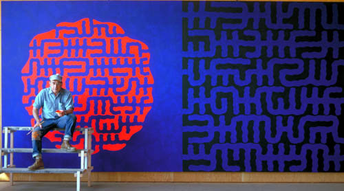
The large paintings of the decade beginning in 1966 have the same title as the book of drawings, but their formal vocabulary is quite different because they are not limited to black lines of uniform width on a white ground. The painted cycle is predominantly of large scale and has different self-imposed limitations to the colors black, blue, and orange/red and to its restricted formal vocabulary. These parameters formed the foundation for the cycles of work of the ensuing twenty years or so, through the sixty-four canvases of the I Ching. In the course of working on the e.g. series, the artist began to employ what I would call his calligraphic vocabulary—wavy horizontal bands that seem to be the letters of an inscription in a lost language. In some later works, portions of these calligraphic bands are gathered into oval or circular shapes.
In these, the grid returns in a new guise as an organizing structure. Canvases are divided into distinct upper and lower parts, underscored by changes in the color of the ground, or, in a few instances, by a white horizontal line across the center. In fig. 6 [e.g. 30, 1975, 22” × 30”], the dominant orange/red figure occupies the upper left, the center, and the lower right areas of the surface.
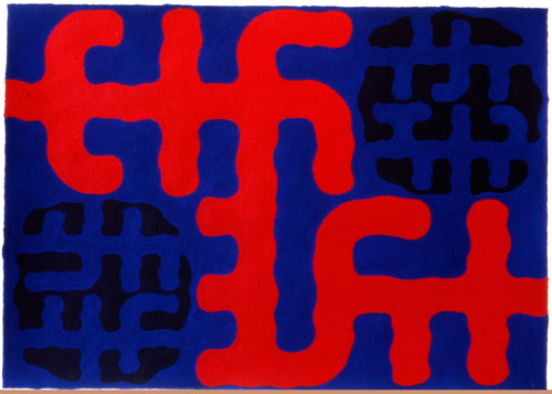
Fig. 6 e.g. 30, 1975 (22” × 30”) acrylic on paper
At first, the painting appears to present the orange/red figure and two black ones layered over a blue ground. But an ambiguity appears on closer inspection: within the black quasi-circles, the “lettering” of the inscription-like bands is made up of the blue of the ground, so that within the figure the black forms become the ground.
The close of the e.g. cycle some twenty years ago coincided with the abandonment of the artist’s purely abstract work. There followed a sequence of projects that are “representational,” not in the usual sense of the word, but in a personal and unique way, in being responses-to rather than illustrations-of the narrative or symbolism of written texts.
THE I CHING CYCLE, 1976–1979
The project of 1976–1979 to produce a series of large (6’ × 9’) canvases devoted to the sixty-four changes of the ancient Chinese text of the I Ching marks a watershed in the artist’s work. It was the first of a series of engagements—continuing to the present—with canonical books and myths that have been preserved for millennia in their several cultures as illuminations of their approach to life, death, and the hereafter.
The ambitious scale of the I Ching project has until now prevented anyone, including the artist, from seeing it as a whole, since the sixty-four paintings of this series have had to be stored in his studio in deep stacks in which only the outermost canvases could be seen. Jesse’s burning desire to see them all together ultimately overcame his reluctance to exhibit publicly.
The I Ching is a text consulted over a greater span of time than any other in existence. Its origin is unknown, but it existed long before Confucius (551–479 BCE), who turned the original version, used primarily as a vehicle for divination, into a monument of profound philosophical and cultural significance. The I Ching is also known as The Book of Changes[9] because it is rooted in a concept of opposing forces and in the belief that even the most intractable oppositions in human relations and the phenomena of nature are subject to change in time. The divinatory origins have been preserved in the practice of manipulating handfuls of yarrow stalks (short round sticks) in order to arrive at numbers that can be applied to the reading of the changes. The Chinese philosophical tradition is particularly concerned with chance as a motivator of events, in contrast to the causal explanation of events typically sought in Western thought.
Each of the sixty-four changes represents a set of relationships expressed symbolically by a diagram made up of firm (unbroken) and yielding (broken) lines. The lines are gathered horizontally in “trigrams”—sets of three from which eight different combinations of the unbroken and broken may be made. The trigrams are then combined in pairs to make up “hexagrams” so that sixty-four unique variants may be produced.
Each of Jesse’s large canvases is an elaborated version of one of the book’s hexagram diagrams. Fig. 7 (diagram of I Ching 44, Kou) shows the pattern of hexagram 44:

Fig. 7 diagram of I Ching 44, Kou
Kou/Coming to Meet;[10] fig. 8 (I Ching 44, Kou, 1978, 9’ × 6’), the painting based on it, repeats the same five horizontal lines at the top and the one broken line at the bottom. Jesse elaborated the simple horizontals of the diagrams: three are soft, wavy bands in blue and orange-red, and three are bands resembling the undecipherable inscriptions that originated in the e.g. series of the preceding decade. One significant departure from the approach to the e.g. paintings is that there is no optical reversal of figure and ground; the ground is uniformly black and the colored bands appear to be laid upon it—primarily, I think, because the authenticity of the paintings depended on their adherence to the diagrams.
Fig. 8 I Ching 44, Kou, 1978, (9’ × 6’) acrylic on canvas
Jesse’s attraction to the I Ching is due in part to his belief that the book affirms his convictions about the relationship of his paintings to the viewer. He has said that just as each person who consults a particular hexagram finds in it a different message and finds a different message on each subsequent consultation. Each viewer finds his/her own meaning in one of the paintings (not just those of this series, but any of his paintings). So, in his view, the book, or the painting, has no inherent meaning but acquires one in dialog with the reader/viewer.
KABBALAH
The I Ching series was
followed by a cycle of paintings based on the Kabbalah
(1980–1988). Jesse’s father, Morris Reichek, was a devoted student of the
Kabbalistic tradition who ultimately moved to Israel to be among other elders
who shared his commitment. As an adult, Jesse did not adhere to his religious
roots; when he turned to a study of the Kabbalah in his sixties, it was, like
his interest in the I Ching, as a document of a great tradition, not one
he had sought out for religious reasons. But, whether consciously or
unconsciously, his intense life-long engagement with traditions preserved in
writing has been a reflection of the heritage of scholarship in Orthodox
Judaism. It is also consistent with the rigorous discipline that characterizes
his relation to his studio work.
The Kabbalah is a text that, in the course of the thirteenth and fourteenth centuries, gave a functional and stable structure to a body of ancient mystical Jewish writings known to have existed in the first century, themselves originating in a long oral tradition.[11] The Kabbalah concentrates on the reading of the Torah, the first five books of the Old Testament, emphasizing divine names and the letters from which they are composed. An early Kabbalist, Nahmanides, wrote, in describing this interpretation, “The Entire Torah consists of the names of God; the words we read can be divided in different ways so as to form names.” Thus, many of the paintings in Jesse’s series are pictorial versions of what is called the “tetragrammaton”: YHWH. There are two bodies of work in his Kabbalah series: Exegesis, one hundred canvases of differing dimensions, and One, two hundred paintings on sheets of heavy-weight Arches paper. This was Jesse’s first extended experiment with painting on paper. He had been working with acrylic paint since the start of the e.g. series of the mid-sixties. His relinquishing of oil paint was prompted less by the coloristic potential of acrylic (since the limitation of his palette to three colors at that time rendered differences of the two media unimportant) than by the rapid drying of this water-based medium, which eliminated the often extended drying time required by oil paint—an important factor in projects involving a large number of canvases.
The acrylic medium, apart from its practical advantages, is particularly suited to Jesse’s aims as a painter. It encourages thin and dry surfaces without variations of texture or the suggestion of atmosphere. It supports his intense, meticulous working technique and is in harmony with the cerebral messages of his art.
The two bodies of work comprising the Kabbalah series depart radically from the limited color range of the preceding paintings. Acrylic is hospitable to a wider spectrum of hues than almost any other medium and invites variety in the sense of both brilliance and of subtle, subdued tonalities. This brilliance was exploited in the Kabbalah and Song of Songs series and is a fundamental component in the subtlety in work after 1990. In adopting acrylic, Jesse opened up an exploration of great potential.[12] The paintings in the Exegesis series were the last canvases of Jesse’s career. From that time on, he concentrated on works on paper of uniform dimensions. He told me recently that this change was due to two purely practical exigencies imposed by age—first, that he no longer wished to work at heights requiring a ladder or scaffold, and, second, that he preferred to work in the small, insulated study in a corner of his studio rather than to be exposed to the cold and damp of the main space.
The color of both the canvas and paper Kabbalah paintings is often raw and intense. Given the focus of Kabbalah commentaries on the mystical inferences of words, the artist’s earlier use of an inscription-like vocabulary is continued and expanded. A large portion of the paintings focus on the tetragrammaton, which appears in many different forms; it is the first time in Jesse’s work that the letters of living languages are adapted. But there are also new text-like inventions, made-up forms laid out in horizontal lines as if they were to be read.
In fig. 9 (Exegesis 41, 1984, 6’ × 4’) the green square and the red rectangle lie under the surface forms. The tetragrammaton YHWH is spelled out in tall, blue, animated letters that read, as in Hebrew, from right to left. The black figures above are imaginative free forms that seem to want to break away, but, in fact, the vitality of the composition is achieved by constraining both the figures and the letters through a grid of orderly horizontal and vertical bands.
Fig. 9 Exegesis 41, 1984 (6’ × 4’) acrylic on canvas
SONG OF SONGS
In 1988, following the Kabbalah series, the artist moved to another biblical source, the Song of Songs (1988–1990), in a suite of one hundred sixteen acrylic paintings on paper. This exotic love poem, also known as the Song of Solomon, is the last of the five books of the Old Testament. Its subject is the courtship, lovemaking, and marriage of Solomon and his young and beautiful wife, recounting eloquently and explicitly, but without prurience, their physical passion for one another. While it may be read simply as a romance, Jewish commentators have interpreted it as an allegory of the union of the soul with God; Christians, as alluding to the individual’s bond with Christ or the Virgin Mary.
In this series, each statement of the biblical text is accorded a picture, but the images are not intended to convey the specifics of the text; they are personal responses to the artist’s readings. Because the paintings are on paper rather than canvas, the facture is significantly altered: they are executed at less-than-arm’s length with small brushes and are best seen relatively close-up. In contrast to the I Ching pictures, which are based on symbols arranged vertically, they are oriented horizontally, and the forms—more dispersed and individualized—are new to the artist’s work. In contrast to pictures in the Myths series that followed, these do not incorporate recognizable symbols, such as those for men, women, animals and trees. The forms lie flat on the surface and avoid ambiguity between the figure and the ground. They respond to the sensuousness of the text with their looser composition and subtle color, which is less intense and aggressive than in canvases from the Kabbalah series.
Fig. 10 (Song of Songs, Book V, verse 16, 1988, 22” × 30”) is the image for verse 16 of Book 5, which reads “His mouth is delicious/And all of him is Delightful/Such is my beloved/Such is my darling/ O maidens of Jerusalem.”[13] The painting has a spirited vivacity in its color and in the variety and angular vigor of its major figures, the movements of which are intensified by the balanced placement of the parts and by the constraints of the paper’s edges.
Fig. 10 Song of Songs, Book V, verse 16, 1988 (22” × 30”) acrylic on paper
The rich but modulated color range of the Myths is built on that of the Song of Songs, but is more muted. I find the color such an enriching aspect of my pleasure in these works that, despite the artist’s effort to reject persuasion, I am drawn in.
While visiting Thailand in 1993, Jesse wrote down thoughts on the purposes and power of his art that expanded on his previous theoretical and critical writings. He focused on the concept of persuasion—the power of a painting to manipulate its viewer, a power that he has always rejected. How could it be relinquished? By transferring to each viewer the right, even the obligation, to find his/her own meaning in the work of art. Jesse ingeniously wrote that his painting is an instrument to transmit the viewer’s ideas to the viewer. It does not matter what intention an artist has when he makes a painting or other form of art; often he/she is unaware of the intention while at work—so much of the process is unconsciously guided—or conceivably even misreads what he/she believes it to be. The artist’s part is to create a structure open enough to host a dialogue into which the viewer may enter with confidence. For this reason, today’s typical visitor to a museum or exhibition, who may feel him/herself incapable of enjoying the experience of a work of art without instruction on what to look for and what the artist meant to “say,” is reluctant to or even incapable of having an autonomous response. The challenge to the viewer is to exercise “critical thinking” in formulating his/her response to the work; in this way, a painting can raise his/her consciousness. The person who possesses the capacity for critical thinking about works of art can exercise and refine it in other spheres and, thereby, become more empowered. In this way, the work of art can function as a political-social force.
This viewpoint is in harmony with that of a number of artists and critics of Jesse’s generation: for example, several of the minimalists of the sixties and seventies, a time when many of the most prominent artists wrote and spoke extensively about the role of art in relation to its public.[14]
MYTHS
Jesse has been occupied for the last fifteen years in cycles of paintings on paper that represent universal myths—myths recorded from many parts of the world that preserve stories of humankind in its relation to creation and to a Creator, being in the world, apotheosis, the afterlife—the most elemental concerns of the species (1990–1994, Creation, 223 paintings; 1995–2000, Mortality and Immortality, 248 paintings, and Death, over 200 to date—all acrylic on paper of uniform dimensions—22” × 30”).
This enterprise has differed from those text-based cycles that preceded it (Kabbalah, Song of Songs). A myth, according to the Oxford English Dictionary, is a “traditional story, typically involving supernatural beings or forces, which embodies and provides an explanation, ætiology [cause], or justification for something such as the early history of a society, a religious belief or ritual, or a natural phenomenon.” Most myths were originally conveyed orally. In modern times, written versions of many of them have been published, collected from many cultures, a process that risks misinterpretation by the recorder and the loss of the improvisatory opportunities of the oral tradition. As a result of Jesse’s determination not to use painting as a form of persuasion, the Myths series does not presume to interpret the narratives visually but simply to register aspects of the artist’s response to them. Yet, the paintings employ in abstract form many recognizable figures (man, woman, child, livestock, birds, rivers, houses—all of which are part of Jesse’s environment). The humans and animals often resemble those in southwest Native American art, the geometric forms of which have roots in their accommodation to the rectilinear construction of textiles; again, the grid is a constituent support of the composition.
Most of the paintings retain the flat figures laid on a uniform ground that Jesse had employed in the earlier series, and many have the kind of underlying grid characteristic of works since the seventies. The variety of figure types is markedly increased, and the color scheme is rich in unfamiliar, subtle, mostly pale hues and excludes primary colors. Both the forms and the colors are uncommonly varied and lively—quite removed from the asceticism of the e.g. and I Ching paintings.
There is as much variety in the hundreds of Myths paintings as there is in the myths themselves, so that no one of these works can properly be called typical. But fig. 11 (Story 228, 1995, 22” × 30”), from the series Mortality/Immortality, illustrates the character of the color—the absence of primaries, the muted and uncommon hues—though it is atypical in not being built on an overall ground. Abstract human figures fill four of the strips.
Fig. 11 Mortality/Immortality, Story 228, 1995 (22” × 30”) acrylic on paper
A comparison to fig. 12 (Creation, Story 147, 1992, 30” × 22”), from the Creation series, shows how varied the structure and color range of the paintings from the Myths studies can be. Here bands of mustard-yellow are composed like a labyrinth; a vehement, angular figure at the center seemingly presses against its rectilinear confines.
Fig. 12 Creation, Story 147, 1992, (30” × 22”) acrylic on paper
This painting illustrates the textile-like format that characterizes many in the series, but it conveys a vitality that is difficult to equal within the constraints of the loom technique.
When Jesse shows me these pictures, he takes neatly stacked groups of about twenty from one of the many drawers in which they are arranged by years, sets them up against an easel on a table, and, with a measured pace, reveals one at a time (fig. 13, Jesse showing the author paintings from the Myths); it’s like a sequence of frames from a film, except that each is completely different from its predecessor. I am in awe of the towering level of invention in the ensemble, but at the end I lose my grasp of the individual works (which makes me especially eager to see them together in one of the projected exhibitions).
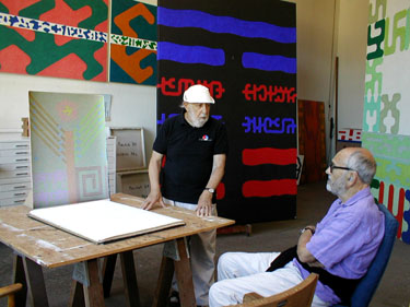
Fig. 13 Jesse showing the author paintings from the Myths
Jesse’s huge ambition and intense focus in planning a project that would encompass the major structures and beliefs of societies throughout the world, beginning with one of the most ancient and influential Chinese texts to have survived from pre-Confucian times, demanded years of preparatory research in studies of myth, religion, and cultural traditions. The discipline demanded by these studies is matched by the discipline of his practice: the regularity with which he entered and left his studio, the orderly arrangement of tools and working supplies, and the unerring precision with which each stroke of a brush is placed on the canvas or paper. Now, nearing ninety, his hand is as steady and un-erring as in his youth.
The rigor and the character revealed in Jesse’s exceptional productivity is not just evidence of a highly disciplined approach to work, but of his and Laure’s having established a way of life that excludes much of the unnecessary distraction, without sacrificing time for the visits of friends and for political and social engagement. The television set and radio are rarely used; there is no computer, and no daily newspaper arriving at the door. The sole environmental noises are the occasional wind or rain and the morning brays of two pet burros and a mule demanding their breakfast.
ILLUSTRATIONS
1. 25 October 1950, 63 3/4” × 51 1/2”
2. Dessins 11, 6 3/4” × 5 1/4”
3. Parsons installation, 1963
4. Galerie des Cahiers d’Art installation, 1967
5. e.g., p. 14, IBM computer-generated, 7” × 6 1/2”
6. e.g. 30, 1975, 22” × 30”
7. Diagram of I Ching 44, Kou
8. I Ching 44, Kou, 1978, 9’ × 6’
9. Exegesis 41, 1984, 6’ × 4’
10. Song of Songs, Book V, ; verse 16, 1988, 22” × 30”
11. Mortality/Immortality, Story 228, 1995, 22” × 30”
12. Creation, Story 147, 1992, 30” × 22”
13. Jesse showing the author paintings from the Myths
NOTES
This essay could not have been written without the photographs of Jesse’s paintings and daily life compiled with great skill by the artist’s sons, Jonathan and Joshua Reichek. Whatever coherence it has, to borrow the phrase with which Jesse salutes Laure, has been made possible by my wife, Jill Slosburg-Ackerman.
[1] 1967 statement for an exhibition at Galerie des Cahiers d’Art in Paris.
[2] His consistent use of dates as titles of paintings is a strategy to avoid directing the viewer; accordingly, I would not expect him to confirm my reading of the painting.
[3] The Chicago Design Institute had recently been assimilated into the I.I.T.
[4] Here and in subsequent cases of my use of “figure,” I mean it to refer to a clearly defined shape within a painting, while “ground” refers to the initial painted surface upon which the figure is placed.
[5] Lee Hall, Betty Parsons, New York, 1990.
[6] Around 1965–1966, the shaped support began to be used by some of the most recognized New York painters, among them Frank Stella, Kenneth Noland, and Ellsworth Kelly.
[7] A title, like Etc., calculated to circumvent associations on the part of the viewer.
[8] Abbreviation of “exempli gratia”, meaning “for example.”
[9] The I Ching, or Book of Changes. The Richard Wilhelm Translation rendered into English by Cary F. Baynes. Third Edition, Princeton, 1969, pp. 170ff.
[10] According to the translated text, Kou/Coming to Meet,
“ … indicates a situation in which the principle of darkness, having been eliminated, furtively and unexpectedly obtrudes again from within and below. Of its own accord the female principle comes to meet the male. It is an unfavorable and dangerous situation, and we must understand and promptly prevent the possible consequences.”
The hexagram is linked with the fifth month (June–July) because at the summer solstice ‘the principle of darkness gradually becomes ascendant again…”
One explanation of the title “coming to meet” is: “The inferior man rises only because the superior man does not regard him as dangerous and so lends him power. If he were resisted from the first, he could never gain influence.” Details of such oracular prophesies continue for another three pages, and are difficult to decipher without an extended study of the principles of the book; but one must read with the understanding that their meanings are neither wholly consistent among themselves nor when sought by the reader on different occasions, which is one reason for the subtitle Book of Changes.”
[11] The principal source of this description is Gershom Scholem, On the Kabbalah and Its Symbolism, New York, 1965
[12] Jesse's use of the medium differed from that of the group of the so-called Color Field artists who, starting around 1960, pioneered in applying acrylic paint to unsized canvas, causing it to soak into the fibers of the cloth support, thereby producing intense colors with soft and vaporous outlines.
[13] The translation is from Tanakh: the Holy Scriptures. The New York Jewish Publication Society, Philadelphia, 1985.
[14] For example, Judd, Serra, André, Morris, Le Witt, The prevailing tone of the writings of the period was Macho; women artists were relegated to the sidelines and their views rarely surfaced. An early and influential critique of persuasion, opposing that of the minimalists, was Michael Fried’s Art and Objecthood, (1967) republished in Art and Objecthood: Essays and Reviews, Chicago, 1998, pp. 148–72.